Back to the brand logo
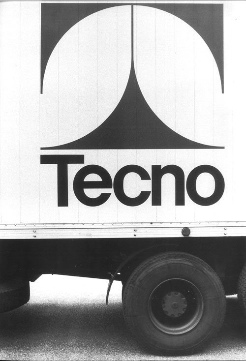
The entire Tecno concern is joined under the mark of the initial T of its name, but it is also a cosmic symbol for its likeness to the cross and to the structure of the human body. Or, with less emphasis, an outline of orthogonality: the essential meeting point between vertical and horizontal. Much of Tecno’s philosophy is revealed in its brand. The ethics, aesthetics, economy of planning: what starts out as essential tends to become classic; it is positioned in a dimension where harmonies and coincidences, albeit surprising, appear entirely natural.
Thanks to the partnership with Studio Tassinari Vetta, the brand rediscovered its original soul through the respectful geometrical redesigning of the iconic T supported by a new typography which, in a restyling of the original spirit, is based on a linear Neo-Grotesque font as the new narrative of the brand.
.jpg)
T for Tecno
When Osvaldo Borsani, in the early 1950s, suggested to his twin brother Fulgenzio and their father Gaetano Borsani that they should set up a new company dedicated to the mass production of technical interior design objects, he was probably already aware of the need to give this idea a boost through a brand. However, it was in 1954, on the occasion of the X Triennale exhibition in Milan, that the famous capital "T" designed by Roberto Mango appeared. With the aim of representing the strong simplicity of the shape, the quality of the materials and of the workmanship, the focus on the growing opportunities afforded by technology and the changing needs, the company adopted the T as a major cornerstone.
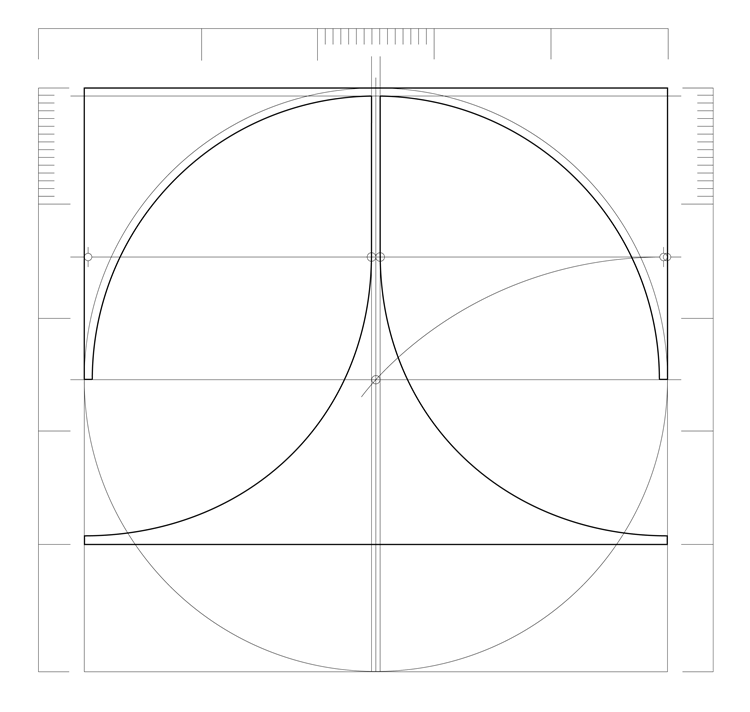
The geometrical construction
“The T came to be like this, in one go, a sketch while I was standing on the steps leading up to the Triennale exhibition in 1954, the Tenth edition. The letter T, like the letters A, H, U and V, is an axial, symmetrical letter. It also represents a construction: it has a base, a support and a top. This geometric matrix seemed the perfect way to interpret the new spirit of Tecno graphically. Avoiding the harshness of corners and resorting to curves. Only the curve could give the necessary sense of technology and industrial precision, mediated by freedom of expression. The curve sets the sail of its choice. Which curve? Which relations? Based on the idea of “Tecno” - the idea of identical, repeatable, precise yet at the same time new and free elements - the pencil immediately found a single curve defined by a compass. At the top, a large upper arc (the top), a semi-circle, in other words two quarter circles. Then, similarly, two equal quarters, but upside down (the base) [...]. Today, when I think back on the spirit of those days, I am extremely satisfied to have found a sign that was built, has lived and grown well”. Roberto Mango, from a letter to Giuliana Gramigna, 1990
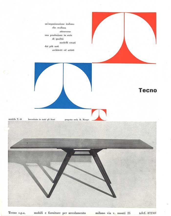
The cornerstone
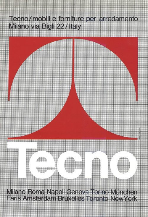
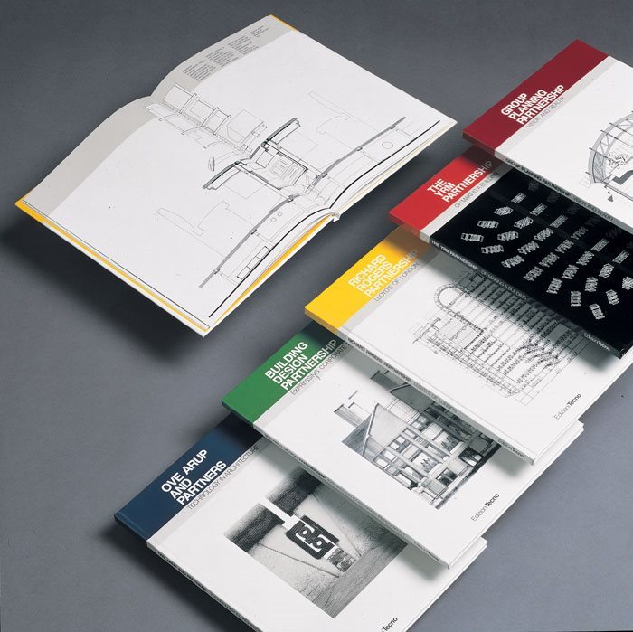
From catalogues to advertising, over the years Tecno has paid immense attention to the communicative quality of the written word and of visual graphics, which were initially under the responsibility of the Borsani brothers themselves. With time, the brand became the key element of recognition of the company, which is why the Borsani brothers decided it was time to consolidate the company image and chose to bring this aspect of communication into a new coordinated design organisation too. From 1972 onwards, the recently established Tecno Design Centre was in charge of the in-house communication design team, thanks to the coordination of Roberto Davoli.
.jpg)
Contemporary, for 60 years
To this date, the visual identity relies on the original values in an up-to-date interpretation, creating the foundations for the development of a contemporary visual language.
Launched as a preview at Orgatec 2018, where the reference to manual writing, or calligraphy, symbolised the renewed focus on the human figure in the centre of the labour world, the new coordinated corporate identity with the design by Tassinari/Vetta has progressively been applied to the entire Tecno universe.
.jpg)
.jpg)
.jpg)