From The Archives: T69
It is no coincidence that its harmonious lines give a nod to the brand logo: a geometric language that shuns the rigour of sharp angles in favour of curves.

_-1816045444.jpg)
The graphic sign
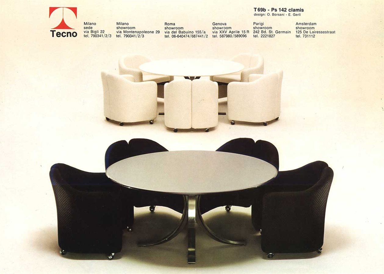
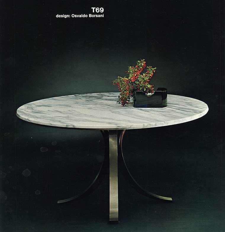
The distinguishing feature of the iconic T69 table is the structural base with its strong graphic character produced by the architectural style. Osvaldo Borsani and Eugenio Gerli seem to draw inspiration from the iconic T logo by Roberto Mango, echoing its elegant form and the philosophy concealed in this symbol.
_-1077687485.jpg)
A manifesto for the table
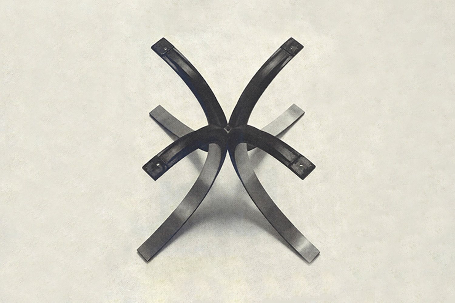
The characteristic trait of this type of table is the load-bearing structure constructed from two cross-connecting cast elements in the shape of two tangential semicircles. Two criss-crossing Double Ts that open out like a flower in full bloom. A tribute to the poetry of the “I-beams” technique so ingeniously used by Mies van der Rohe in his skyscrapers.
_15660192.jpg)
Soft elegance
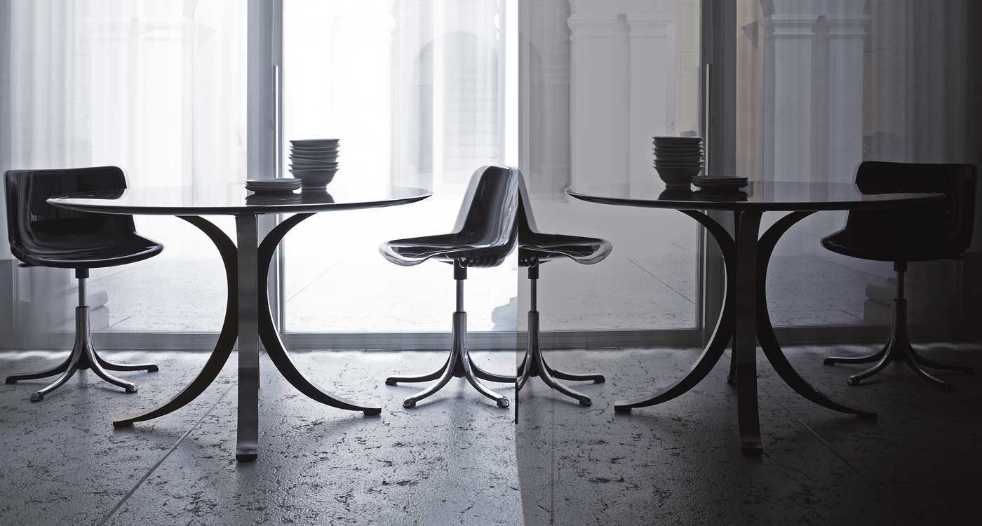
The table's characteristic trait is the load-bearing structure constructed from two identical elements in metal with an enamelled underside. The choice of black seems to strive to slim down the thickness and accentuate the curve, making it lighter and creating a soft, iconic silhouette. The aluminium casting techniques, satin finished externally and matt-black painted internally, are a signature found in numerous products, from Modus chairs to the large T334 and T335 tables.

.jpg)

.jpg)
